
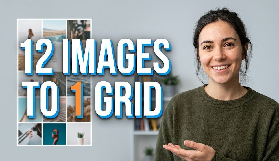
Creating a grid-style image by combining multiple photos into a single layout has become one of the most popular ways to present visual stories in a clean and engaging format. Whether you are showcasing travel memories, product collections, or personal moments, a 12-image grid allows you to organize your visuals in a structured yet creative way. This technique is widely used on social media platforms and portfolios because it delivers more content in one frame while maintaining visual clarity. A well-designed grid not only looks professional but also helps in capturing attention quickly. With the right approach, you can turn ordinary images into a powerful visual narrative.
Choosing the Right Photos
Select High-Quality Images
The first step in creating a 12-image grid is selecting the right photos that align with your theme or story. It is important to choose high-quality images that are clear, well-lit, and visually consistent. Avoid mixing images with drastically different lighting or color tones, as this can disrupt the harmony of the grid. Instead, aim for a balanced collection where each image complements the others. If your topic is travel, select photos that represent different moments of the journey. If it is about products, ensure each item is presented neatly and consistently.
Defining a Clear Theme
Maintain Visual Consistency
Once you have selected your images, the next step is to define a clear theme or concept for your grid. A strong theme helps in maintaining visual coherence and makes your layout more appealing. For example, your theme could be “A Day in My Life,” “Before and After,” or “Top 12 Moments.” When all images follow a single idea, the final grid looks more meaningful and impactful. Without a clear theme, the grid may appear random and less engaging to viewers.
Selecting the Perfect Grid Layout
Balance and Symmetry
Choosing the right grid layout is also a crucial part of the process. A 3×4 or 4×3 arrangement works best for a 12-image composition, as it maintains balance and symmetry. The layout should be simple and easy to follow, allowing viewers to naturally move their eyes from one image to another. Consistent spacing between images adds to the neatness of the design. Avoid overcrowding or uneven gaps, as they can make the layout look unprofessional.
Using Design Tools
Easy Editing with Apps
To create the grid, you can use design tools like Canva or PicsArt, which offer ready-made templates and easy editing features. These tools allow you to upload your images, drag and drop them into frames, and adjust them effortlessly. Even beginners can create impressive grids using these apps because of their user-friendly interfaces. Exploring different templates can also give you inspiration for your design.
Adjusting and Aligning Images
Fine-Tune for Perfection
After placing your images into the grid, it is important to adjust each one carefully. Make sure all photos are properly aligned and cropped to fit their frames without cutting out important details. Consistency in size and positioning creates a polished look. Take your time to fine-tune each image so that the overall grid appears balanced and visually pleasing.

Adding Borders and Spacing
Keep It Clean and Simple
Adding borders or spacing between images can enhance the overall design. Thin white or black borders are commonly used to separate images while keeping the layout clean. Borders help in defining each image clearly and prevent the grid from looking cluttered. However, it is important not to overuse borders or make them too thick, as this can distract from the images themselves.
Applying Filters and Color Adjustments
Create a Cohesive Look
Applying filters or color adjustments is another important step in achieving a cohesive look. Even if your photos were taken at different times, using a consistent filter or color tone can unify them. Adjust brightness, contrast, and saturation carefully to ensure all images blend well together. A uniform color palette makes the grid more aesthetically pleasing and professional.
Adding Text (Optional)
Minimal and Readable
You can also add minimal text to your grid if needed, such as a title or small captions. Keep the text simple, readable, and limited to a few words. Overloading the grid with text can reduce its visual impact. Use clean fonts and place the text in a way that does not cover important parts of the images. Text should enhance the design, not dominate it.

Final Review and Export
Check Before You Share
Finally, review your entire grid before exporting it. Check for alignment issues, color inconsistencies, or any visual distractions. Once everything looks perfect, download the image in high resolution to maintain quality. A well-crafted 12-image grid can effectively tell a story, attract attention, and leave a lasting impression. With practice and creativity, you can master this technique and create stunning visual layouts for any purpose.
Conclusion
Creating a 12-image grid is a powerful way to combine multiple photos into one visually appealing composition. By carefully selecting images, maintaining a consistent theme, choosing the right layout, and applying simple design techniques, you can transform your photos into a professional-looking collage. Attention to detail, such as alignment, spacing, and color consistency, plays a key role in achieving a clean and balanced design. Whether for personal use or social media, a well-designed grid helps you present your story in a more engaging and creative way.
FAQs
1. What is a 12-image grid layout?
A 12-image grid layout is a design format where twelve different photos are arranged in a structured grid, usually in a 3×4 or 4×3 pattern, to create a single combined image.
2. Which apps are best for creating photo grids?
Popular apps like Canva and PicsArt are widely used because they offer easy drag-and-drop features, templates, and editing tools for beginners and professionals.
3. What size should I use for a grid image?
You can use square formats like 1080×1080 pixels for social media or higher resolutions depending on your platform and quality requirements.
4. How do I make my grid look professional?
Use high-quality images, maintain consistent colors, align images properly, and keep spacing even. Avoid clutter and use minimal text for a clean look.
5. Can I add text to my photo grid?
Yes, but keep it minimal. Use simple fonts and ensure the text does not cover important parts of the images.
6. What is the best layout for 12 photos?
A 3×4 or 4×3 layout is ideal as it maintains symmetry and makes the grid visually balanced.