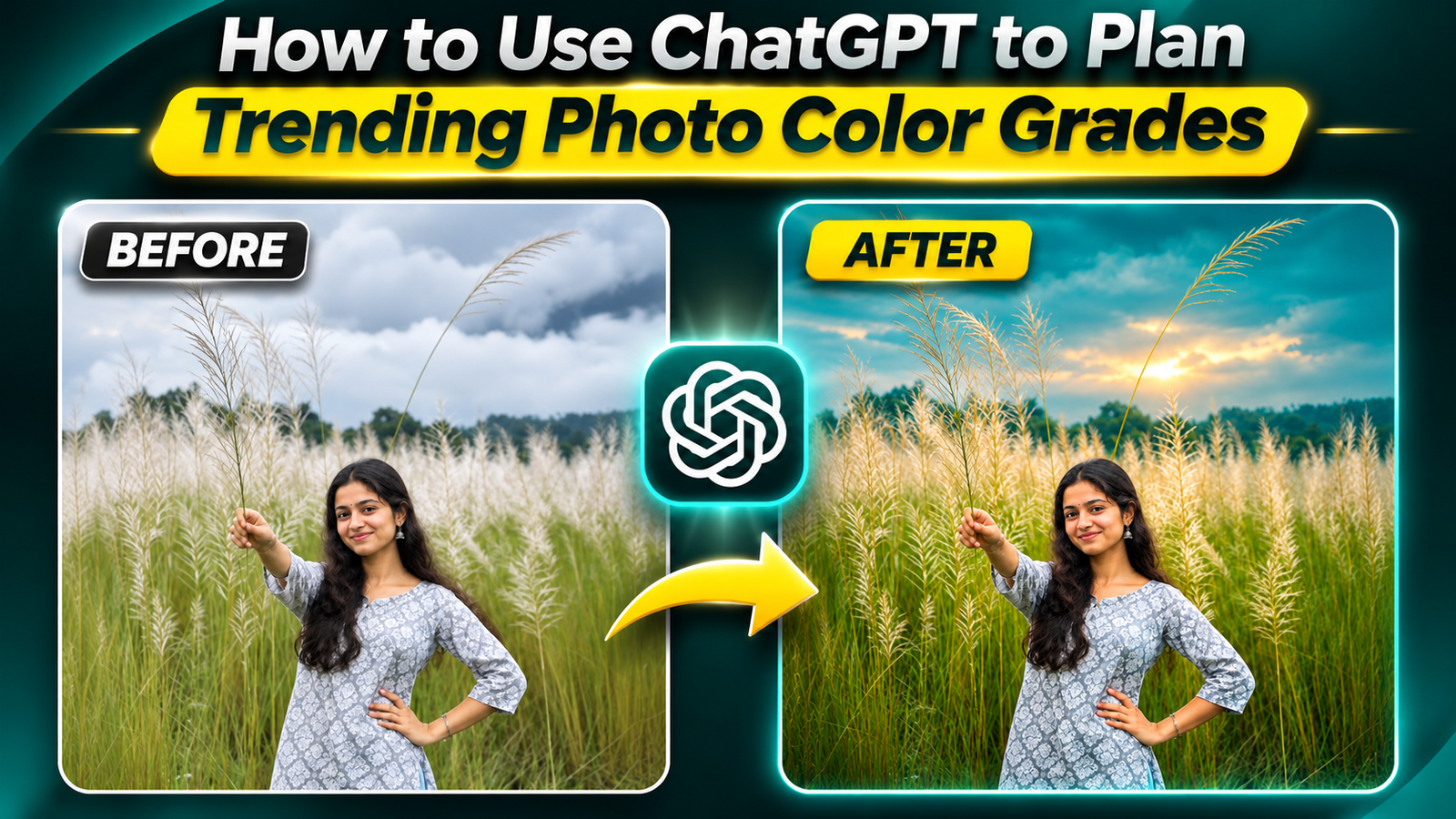
Most people open their photo editor, drag a few sliders, and hope they hit that moody, cinematic, trending look. Then they try a random filter pack and everything looks overcooked.
A smarter approach is to treat color grading like a recipe. That’s exactly where ChatGPT can help: not by editing the pixels itself, but by giving you clear, repeatable grading recipes you can dial into Lightroom, Photoshop, or mobile apps.
What ChatGPT Can (and Can’t) Do for Color Grading
Before jumping into prompts, it’s important to set expectations.
What it can do
- Explain what makes a certain color grade look trendy (e.g., teal‑orange, cyberpunk neon, pastel film).
- Turn vague ideas like moody city at night into detailed editing steps.
- Translate looks from reference photos into slider suggestions (temperature, contrast, HSL, curves, split toning, etc.).
- Adapt a look for specific apps: Lightroom Mobile, VSCO, Snapseed, Photoshop, CapCut photo editor, and others.
What it cannot do directly
- Edit the image file you have on your phone or PC (unless you’re using a separate AI image editor with built‑in ChatGPT‑style tools).
- Read exact pixel values from your photo and guarantee perfect skin tones.
- Magically know what version of your app you use or where each slider is located.
Think of ChatGPT as a color consultant that writes down the recipe. You still cook the dish inside your editing app.
Step 1: Decide the Look You’re Actually Chasing
Make it pop or trending aesthetic is too vague. You’ll get better help if you name a specific style plus a use case.
Examples of trending color grades people usually mean:
- Cinematic teal & orange: cool shadows, warm skin, higher contrast, often used for travel and street portraits.
- Muted film / vintage: low contrast, slightly faded blacks, soft colors, subtle grain.
- Pastel lifestyle (Instagram blogger look): bright exposure, low contrast, warm highlights, soft skin tones.
- Neon cyberpunk: saturated magentas, blues, and cyans; strong contrast; dark overall exposure.
- Moody forest / nature: lifted blacks, cool greens, desaturated yellows, soft highlights.
Pick the lane first, then bring that to ChatGPT.
Step 2: Use ChatGPT as a Color Recipe Generator
Here’s a copy‑paste starter prompt you can adapt:
Once ChatGPT replies, you’ll have a structured set of steps like:
- Exposure: +0.3
- Contrast: +20
- Temperature: +6 (warmer)
- Blues: Hue +15 towards teal, Saturation 10
- Shadows color: teal, low saturation
- Highlights color: warm orange, medium saturation
Use those as starting points, not absolute rules. Every photo needs small tweaks.
Step 3: Translate the Recipe into Your Editing App
The exact names of tools differ by app, but most have the same core pieces.
| ChatGPT Suggestion | Lightroom / Photoshop | VSCO / Snapseed / Mobile Editors |
| Increase exposure +0.3 to +0.7 | Exposure slider under Basic | Brightness or Exposure slider |
| Cool down shadows slightly | Color Grading panel → Shadows hue | Tone / Curves (drag lower part towards blue/cyan) or Split Tone if available |
| Shift blues toward teal, reduce saturation | HSL panel → Blue hue & saturation | HSL / Color tools, sometimes named Blue or Aqua channel |
| Add a soft S‑curve for contrast | Point Curve in Tone Curve panel | Curves tool (RGB) with gentle S shape |
This is where ChatGPT shines: diagnosing side effects of your current grade and suggesting reasonable micro‑adjustments.
Common Mistakes When Using ChatGPT for Color Grading
- Using one recipe for every photo. A sunset beach shot and a dark alley portrait won’t handle the same contrast and saturation. Use the recipe as a base, then adjust for each scene.
- Trusting exact numbers too literally. Exposure +0.7 is meaningless if your original shot is already bright. Think slightly brighter rather than exactly +0.7.
- Ignoring skin tones. Teal‑orange grades in particular can destroy natural skin if you push blue/green in shadows too far. Tell ChatGPT your priority is cinematic but natural skin.
- Forgetting about noise and phone limitations. Aggressive shadow lifting on a noisy phone photo will look bad no matter how good the recipe is.
- Skipping calibration tests. If your display isn’t well adjusted or you’re editing on a very old phone, colors may look different on other devices. Export a sample and check on another screen.
Safety, Ethics, and Practical Limits
- Respect copyright and privacy: When you share reference photos, stick to official campaigns, stock images you’re allowed to use, or your own work. Don’t upload or scrape private photos.
- Check app terms of service: Some platforms limit how you can use or share graded photos commercially. Read the rules if you plan to sell presets.
- Be honest with clients: If you sell editing services or presets, don’t pretend the entire grade is your original invention if you relied heavily on AI planning. You still did the manual work, but transparency builds trust.
- Accept that trends move fast: Trending color grades change. Ask ChatGPT occasionally: What color grading styles are popular on social media fashion photography this year? to refresh your recipes.
Quick FAQ: Using ChatGPT for Photo Color Grades
Can ChatGPT apply the color grade directly to my photo?
No. You still need a photo editor (Lightroom, Photoshop, VSCO, etc.). ChatGPT only helps you plan and refine the settings.
Do I need a paid version of ChatGPT?
For text‑based recipes, the free tier is usually enough. Some advanced image features may require a paid plan depending on the platform and region.
Which editing app works best with AI‑planned grades?
Anything that has exposure, contrast, HSL, curves, and some form of color grading or split toning will translate well. Lightroom (desktop or mobile) is the easiest match, but higher‑end mobile editors also work.
Can I create my own preset pack using AI recipes?
Yes, as long as you actually build and test the presets yourself, and you’re not violating anyone else’s copyright or misusing reference images.
How do I keep my grades consistent across a whole shoot?
Use one AI‑planned base recipe, apply it to a hero image from the session, refine it, save as a preset, then sync/apply across the set and make small per‑photo exposure/white‑balance tweaks.
Used this way, ChatGPT becomes a fast brainstorming partner for modern